MaterialX - Material Design UI - Material Design UI & Reference
Transform your Android apps effortlessly with ready-to-use Material Design components that simplify coding & enhance aesthetics.

- 3.3 Version
- 2.4 Score
- 168K+ Downloads
- Free License
- 3+ Content Rating

Our primary goal is to provide Android developers with references for implementing material design according to the guidelines set by Google.
Many UI challenges today arise from the difficulty in translating design concepts into native source code. Therefore, we aim to explore and analyze Android material design to closely align with the stipulated guidelines. We strive to elevate Material design further.
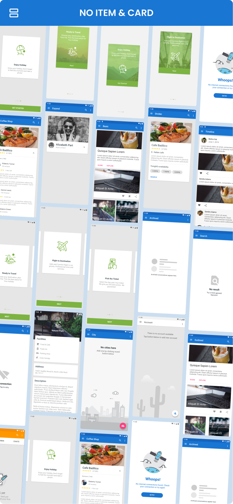
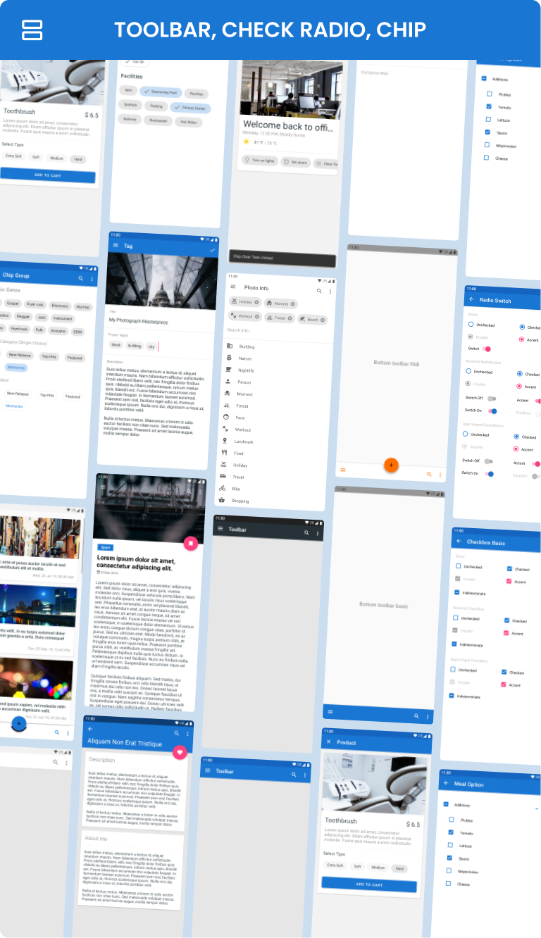
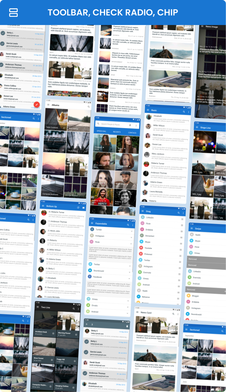
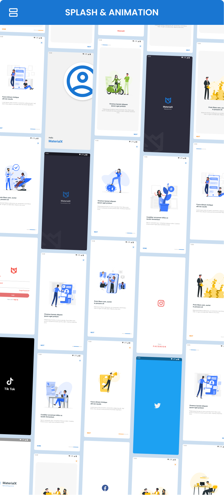
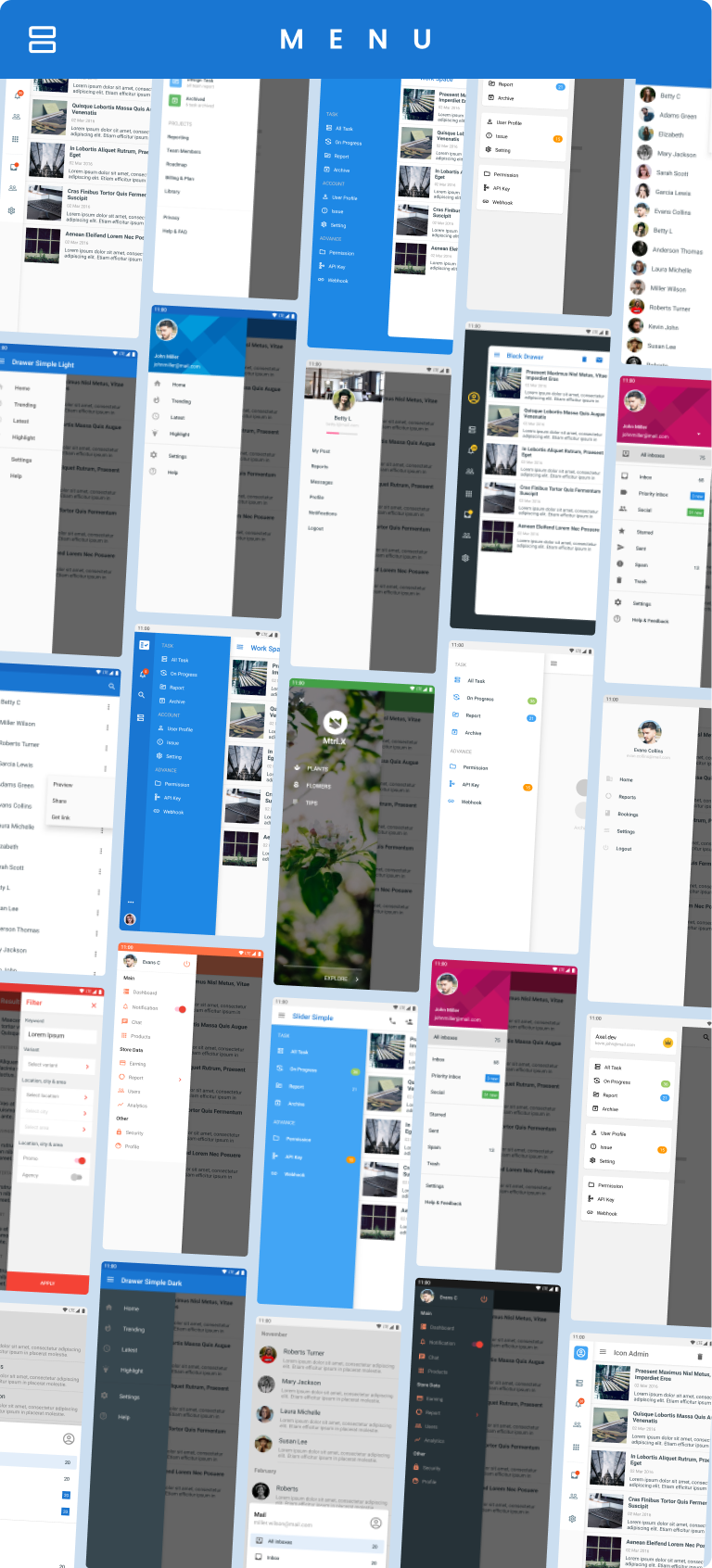
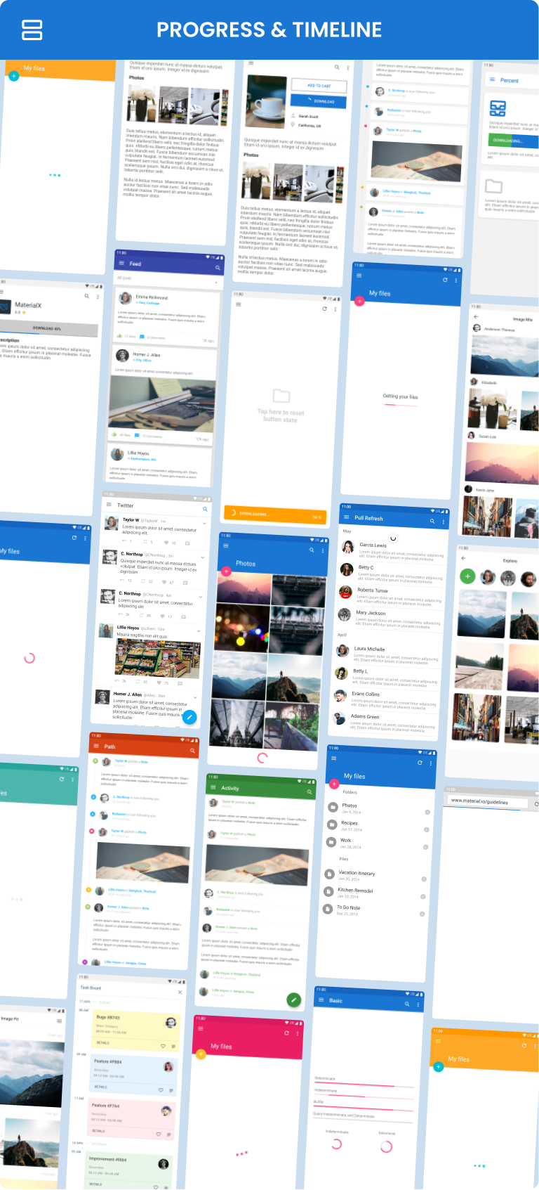
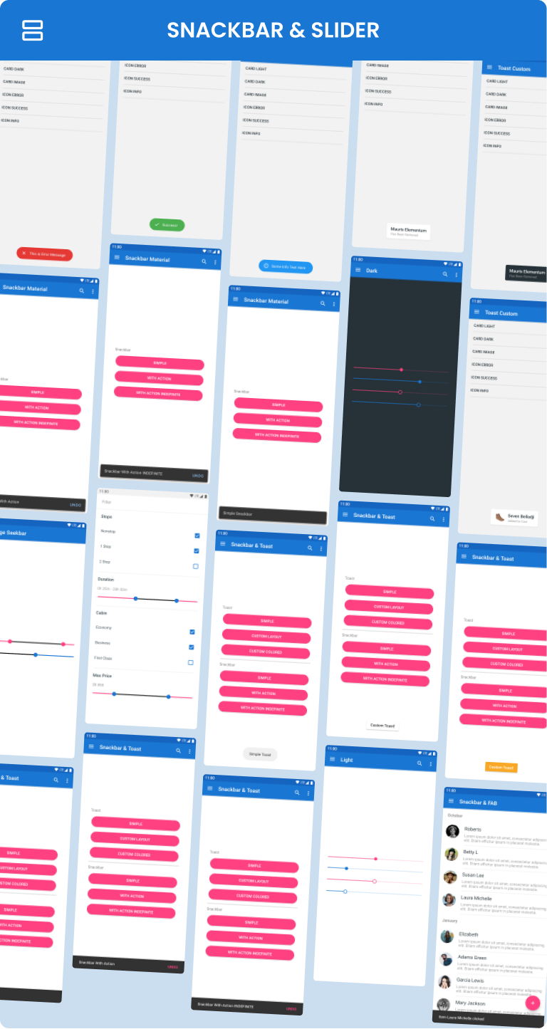
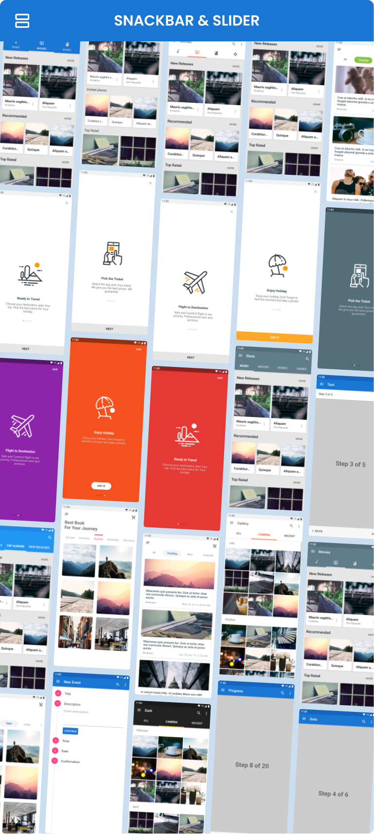
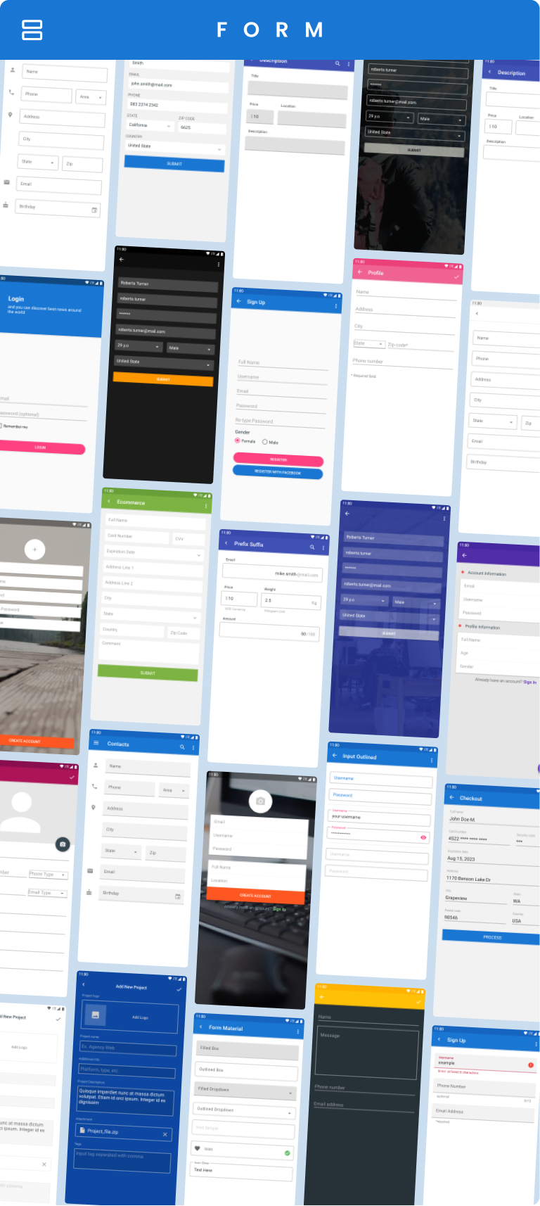
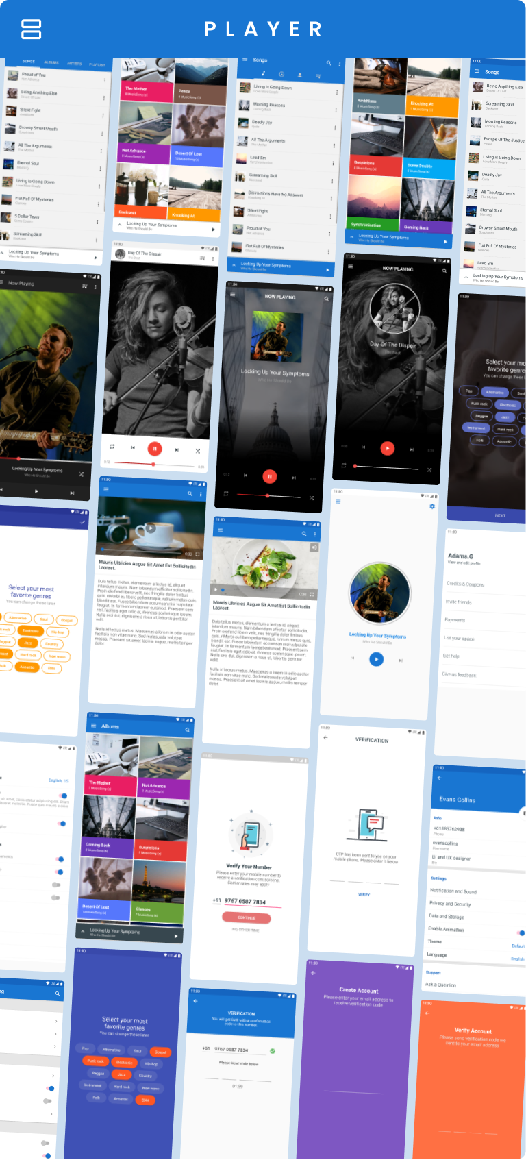
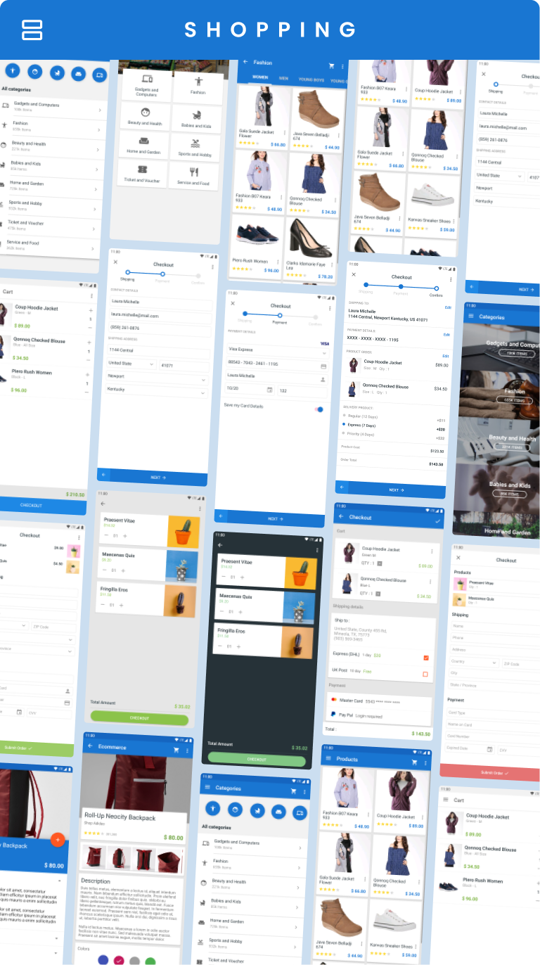
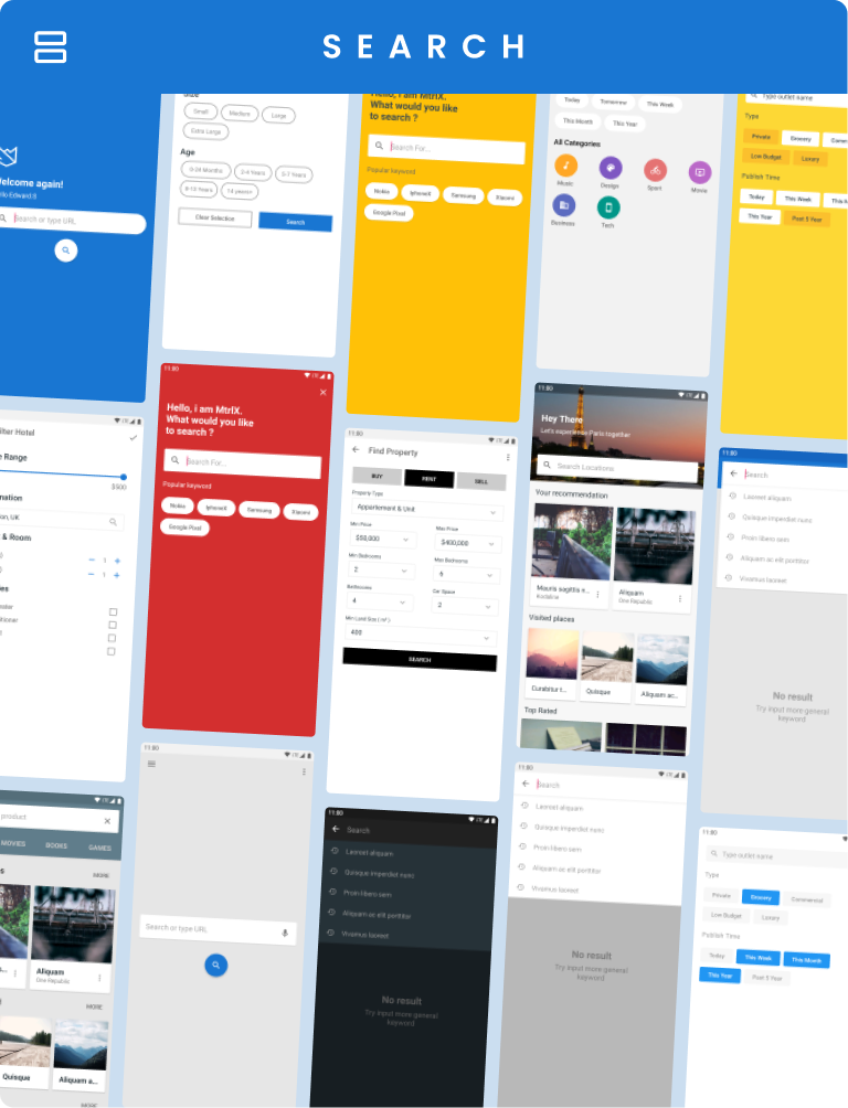
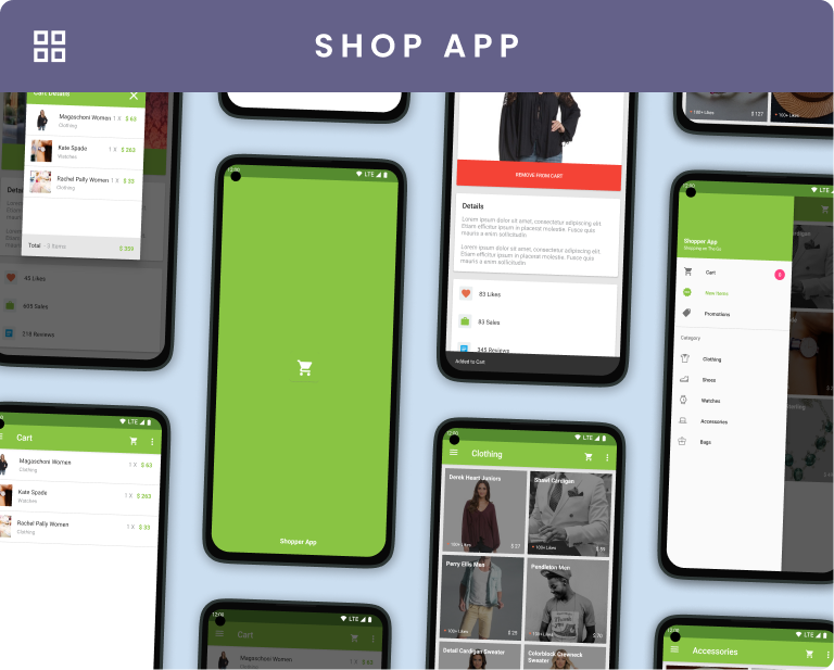
This UI template is ready for use, supporting your projects effectively. You can select components you prefer and integrate them into your code. All folders, filenames, class names, variables, and function methods are well-organized and aptly named, making this template user-friendly for reuse and customization.
An Invaluable Resource for Streamlining Authentic Material Design Implementation
As an Android developer focused on creating polished, professional applications, this UI template library has significantly accelerated my workflow while ensuring strict adherence to Google's Material Design guidelines. The challenge of translating abstract design principles into functional code is one I face daily, and this resource elegantly bridges that gap.
Each component is meticulously crafted and thoughtfully organized—from intuitively named variables to logically structured class hierarchies—making integration into existing projects remarkably straightforward. I've particularly benefited from the comprehensive selection of interactive elements and navigation patterns, which have allowed me to maintain design consistency across different screens without the usual trial-and-error phase.
The code is not only clean and well-documented but also highly customizable, enabling me to adapt the components to specific project needs while preserving Material Design's core principles. This template doesn't just provide reusable blocks; it serves as an educational tool that demonstrates best practices, helping our team produce cleaner, more maintainable, and visually cohesive applications faster than ever before.
Frequently Asked Questions (FAQ)
• How does this help if I'm new to Material Design?
The template acts as a practical reference implementation, demonstrating how to properly apply Material Design guidelines in real code, which is often more illuminating than just reading the specification documents.
• Can I customize these components to match my app's branding?
Absolutely. The templates are built to be flexible, allowing you to modify colors, typography, and other attributes while maintaining the underlying Material structure and behavior.
• Is the code optimized for performance?
Yes, the components are designed with efficiency in mind, avoiding common pitfalls that can lead to sluggish UI, and following Android's best practices for smooth user experiences.
• What Android API levels are supported?
The templates are developed to be compatible with a wide range of API levels, ensuring that your app can maintain a modern design across different versions of Android.
- Version3.3
- UpdateOct 11, 2025
- DeveloperDream Space
- CategoryLibraries & Demo
- Requires AndroidAndroid 4.4+
- Downloads168K+
- Package Namecom.material.components
- Signature5257b3804867849e4949366cadacac30
- Available on
- ReportFlag as inappropriate
-
NameSizeDownload
-
36.14 MB
-
35.99 MB
-
22.86 MB


Quick startup for projects
Offers inspiration for UI design
Helpful for learners and beginners
Good resource for standard components
Regular updates provided after purchase
Includes numerous templates and options
Encourages creativity in app development
Misleading "download" claims for source code
Push notifications for ads are intrusive
Lack of customization features
Ads create frustration and distractions
Basic animations compared to trending apps
Some users find it unprofessional and time-wasting
Confusing user interface with no clear activation of features